Amcor Style Guide 2026
This guide documents Amcor's current design system — colour tokens, typography scale, button variants, spacing, and breakpoints. Reference this page when building pages or integrating third-party work.
1.1 Colors
Brand colors
Brand Petrol
HEX:#00395A | token: petrol
Brand Blue
HEX:#24BBEE | token: brandBlue
Brand Green
HEX:#1BCDAC | token: brandGreen
Brand color variants
Brand Petrol Dark
HEX:#00243F | token: petrolDark
Brand Blue Text
HEX:#009EDC | token: brandBlueText
Brand Green Secondary
HEX:#93E7D7 | token: brandGreenSecondary
Gradients
Petrol Gradient
token: petrolGradient
Brand Gradient
token: primaryGradient
Purple Gradient
token: primaryGradientPurple
Basic colors
Title Gray
HEX:#414142 | token: darkGray
Body Gray
HEX:#616163 | token: bodyColor
Light Gray
HEX:#767676 | token: lightGray
Lightest Gray
HEX:#E1E1E1 | token: lightestGray
State colors
Success
HEX:#1BCDAC | token: brandGreen
Success background
HEX:#E6F8F5 | token: successBackground
Warning
HEX:#FBB055 | token: warning
Warning background
HEX:#FDF5EC | token: warningBackground
Error
HEX:#E73C4E | token: errorText
Error background
HEX:#FCEBED | token: errorBackground
Sustainability colors
Sustainability Green
HEX:#00A551 | token: sustainabilityGreen
Sustainability Paper
HEX:#a67a57 | token: materialPaper
Sustainability Aluminum
HEX:#838483 | token: materialAluminum
1.2 Typography
This is Heading 1
This is Heading 2
This is Heading 3
This is Heading 4
This is Heading 5
This is normal body content
| Element | Tag | Size (desktop) | Weight | Font family |
|---|---|---|---|---|
| Heading 1 | h1 | 2.7rem | 300 | Open Sans, sans-serif |
| Heading 2 | h2 | 2.5rem | 300 | Open Sans, sans-serif |
| Heading 3 | h3 | 1.6rem | 300 | Open Sans, sans-serif |
| Heading 4 | h4 | 1.4rem | 300 | Open Sans, sans-serif |
| Heading 5 | h5 | 1.1rem | 300 | Open Sans, sans-serif |
| Body copy | p | 1rem (16px) | 400 | Open Sans, sans-serif |
1.X Markdown (MarkdownText)
The MarkdownText element renders Contentful content fields (CommonMark + raw HTML via rehype-raw). It is used by the text contentType across all page types. All heading levels, lists, blockquotes, tables, links, images, and HTML sub-elements are styled consistently by MarkdownTextWrapperV2.
Headings — # h1 through ###### h6
Heading 1
Heading 2
Heading 3
Heading 4
Heading 5 — accent callout
Heading 6 — de-emphasised
Body copy — paragraphs, bold, italic, inline code, links
Standard paragraph text. Open Sans 400, line-height 1.47. Paragraph margin is 1rem top / 1.5rem bottom.
Bold text and italic text can be mixed freely. Inline code uses monospace.
Internal link and external link — external links open in a new tab.
Lists — unordered and ordered
Unordered list:
- First item
- Second item
- Third item with a longer label to demonstrate wrapping behaviour
Ordered list:
- Step one
- Step two
- Step three
Blockquote — > text
This is a blockquote. It renders with a petrol background, white text, and 0.8rem border-radius. Use it for pull-quotes or callouts.
Table — GFM pipe syntax
| Column A | Column B | Column C |
|---|---|---|
| Row 1A | Row 1B | Row 1C |
| Row 2A | Row 2B | Row 2C |
| Row 3A | Row 3B | Row 3C |
Miscellaneous — hr, sub, sup, small, image
Horizontal rule below:
Inline size modifiers (raw HTML): subscript · superscript · small text
Image (centred, border-radius 0.6rem):
color="white" — force all text white (use on dark backgrounds)
Paragraph and bold text in white. Link also becomes white.
underlineLinks={true} — underlined links, inherit colour, weight 300
Links with underlineLinks={true}: this link inherits the surrounding text colour and is underlined.
| Prop | Type / Values | Default | Notes |
|---|---|---|---|
| content | string | — | CommonMark markdown + raw HTML (rehype-raw) |
| textAlign | string | — | CSS text-align applied to <p> elements |
| color | string | — | Pass "white" to force all text white on dark backgrounds. Also overrides heading colour. |
| margin | string | — | Pass "none" to strip default <p> margins (tight layouts) |
| maxWidth | string (CSS value) | — | LandingTextSection passes "50rem". Set to limit line length. |
| underlineLinks | bool | false | Underlines links, inherits text colour, sets weight 300 |
| disableParagraphs | bool | false | Renders <span> instead of <p> — for inline single-line use |
| parentDataLayerInformation | shape | — | Passed to MarkDownLink for analytics tracking |
1.3 Buttons
Light background variants
Dark background variants
theme="dark"
Small size
buttonSize="small"
Full width
buttonWidth="fullWidth"
With chevron
chevron={true}
Disabled state
disabled={true}
| Prop | Values | Default | Notes |
|---|---|---|---|
| buttonStyle | 'primary' / 'secondary' / 'default' | primary | |
| theme | 'dark' / 'green' | — | |
| buttonSize | 'small' | — | |
| buttonWidth | 'fullWidth' / 'auto' | — | |
| chevron | true / false | false | |
| disabled | true / false | false | |
| noMargins | true / false | false | Removes default top/bottom margin |
| url | string | — | Renders as link if provided |
| type | 'button' / 'submit' | — | For button element |
| eventClassName | string | — | Analytics tracking class |
1.5 Cards
CardTag — colour variants
Used inside all cards. Always pass hex via tagColorMapper[key].
The mapper also has announcement-type alias keys (e.g. "General Announcements") that map to string values like "Purple" instead of a hex — these are invalid CSS colours and render nothing. Always use the 5 named keys above.
NewsCard
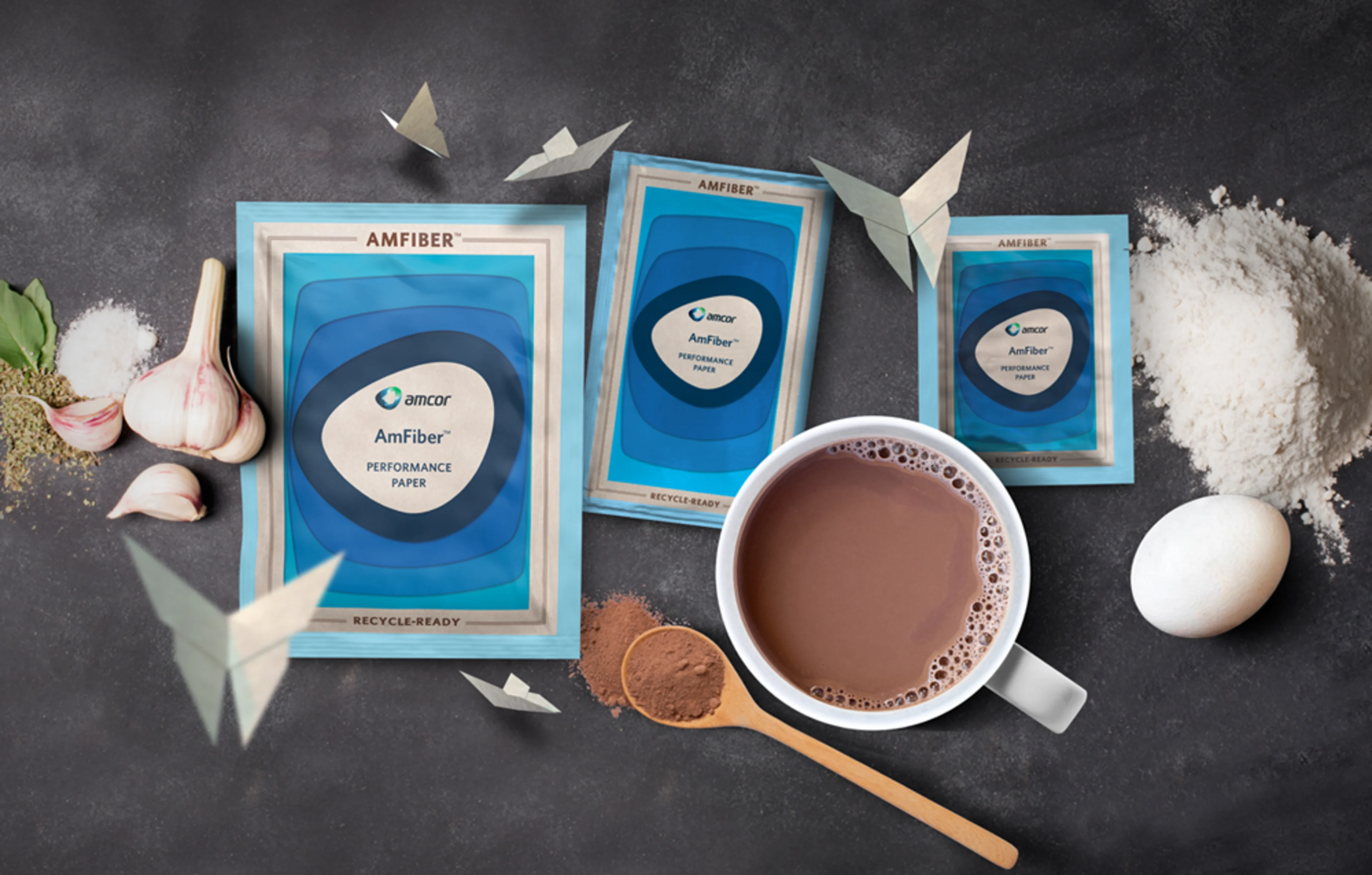
Amcor Expands AmFiber™ Performance Paper Packaging to Include Culinary and Beverages
bannerNewsCard — semi-transparent white background for use on coloured banners
| Prop | Type | Notes |
|---|---|---|
| title | string | Truncated to 200 chars |
| tag / tagColor | string | tagColor is a key for tagColorMapper |
| date | string | ISO date string |
| newsLink | string | Internal link href |
| imageUrl | string | Shown when renderImage is true |
| renderImage | bool | Omit to hide image |
| bannerNewsCard | bool | Semi-transparent white background |
BlogCard
Horizontal card for insights/blog listings. index alternates image left (even) / right (odd).
Packaging Innovation Drives Sustainability Goals Across Food and Beverage Markets
How leading brands are rethinking their packaging strategies to reduce environmental impact while meeting consumer expectations.
How leading brands are rethinking their packaging strategies to reduce environmental impact while meeting consumer expectations.
| Prop | Type | Notes |
|---|---|---|
| title | string | |
| image | { url, title } | Image object |
| slug | string | Used in href via paths.insightsPageShow |
| types | [{ title }] | Required — first type used in href |
| tag | string | Displayed as-is — no colour mapping |
| date | string | ISO date string |
| summary | string | Truncated to 400 chars |
| index | number | Even = image left; odd = image right |
| authors | array | Optional — renders Person if author has image |
EventCard
Event listing card with built-in Add to Calendar button
| Prop | Type | Notes |
|---|---|---|
| title | string | Truncated to 50 chars |
| tag / tagColor | string | tagColor is a key for tagColorMapper |
| description | string | Truncated to 150 chars; falls back to "Join us at {title}" |
| date | string | Display string — not ISO-parsed |
| link | string | External href — opens in new tab |
| imageUrl | string | Logo/banner image (contain sizing) |
ContentCard
Unified document/insight card. Handles both metadata-rich (tag, date, types) and minimal (image + title) configurations. WhitePaperCard is a re-export of this component.
The Future of Flexible Packaging in a Circular Economy
Sustainable Packaging Trends 2024 — Industry White Paper
| Prop | Type | Notes |
|---|---|---|
| title | string | Truncated to 200 chars |
| imageUrl | string | |
| imageTitle | string | img alt text |
| link | string | External URLs auto-open in new tab via InternalLink |
| tag | string | Optional — renders CardTag when present |
| tagColor | string | Key for tagColorMapper (Green / Purple / Yellow / Blue / Red) |
| date | string | Optional ISO date string |
| types | [{ title }] | Optional — content type badge over image |
| eventClassName | string | Analytics class on the link wrapper |
| parentDataLayerInformation | object | Data layer shape for analytics |
ProductCard
Product catalogue card. Receives a single product object from Contentful/Firebase.

GoSmart™
Sachets for Culinary and Beverages Paper
| Prop | Type | Notes |
|---|---|---|
| product | object | Full product object |
| product.productName | string | |
| product.productImages | [{ url, alt }] | First image used |
| product.productHeadline | string | |
| product.productNameSlug | string | Used to build product detail href |
| product.sustainability | array | Sustainability icon badges |
| product.newMaterials | array | New material badges |
| product.valueProps | array | Value proposition tags |
1.5 Icons
Product category icons
Beverages
Food
Healthcare
Home Care
Personal Care
Pet Care
Specialty Cartons
Technical Applications
1.6 Containers
Container
Desktop width: 75%
Small Desktop width: 80%
Tablet width: 92%
Full Container
Width on all viewports: 100%
Detail Container
Desktop width: 50%
Small Desktop width: 70%
Tablet width: 92%
1.7 Spacing & Breakpoints
Breakpoints
| Name | Max-width | Description |
|---|---|---|
| desktop | 1450px | Wide desktop |
| desktopSm | 1280px | Small desktop / laptop |
| navbarTablet | 935px | Nav collapses to hamburger |
| tablet | 768px | Tablet |
| phone | 500px | Mobile |
Container widths
| Viewport | Default container | Small container | Full container |
|---|---|---|---|
| Desktop (>1280px) | 75% | 50% | 100% |
| Small desktop (≤1280px) | 85% | 65% | 100% |
| Tablet (≤768px) | 92% | 92% | 100% |
1.7 Notifications
1.9 Tech Debt & Deprecation Log
| Area | Issue | Status |
|---|---|---|
| No active tech debt items | ||